We use cookies to make your experience better. To comply with the new e-Privacy directive, we need to ask for your consent to set the cookies. Learn more.
Cheap Joe’s Art Stuff Art Blog
Tips, Tricks, Thoughts, and inspiration from across the art spectrum.
-
-
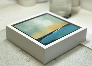
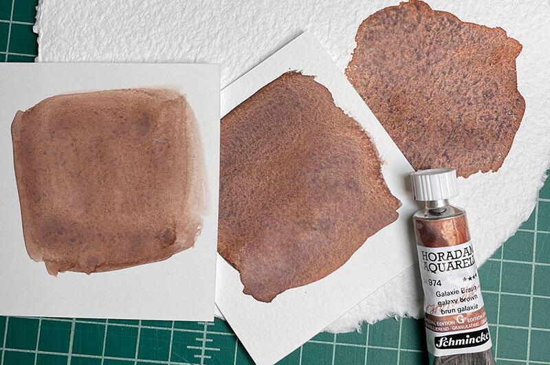 Posted April 08, 2024in WatercolorRead More
Watercolor painting is a mesmerizing and versatile medium that allows artists to create beautiful and expressive works of art. One watercolor technique getting a lot of attention lately is granulation. Granulating watercolors create captivating textures ...
-
 Posted March 02, 2024Read More
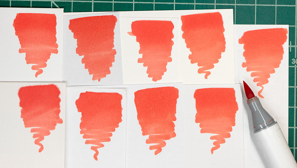
This step-by-step tutorial for beginners is a great place to start learning more about alcohol marker blending techniques. Even if you are familiar with the basics of using markers, if you want to level up your skills, keep reading to discover some of ...
-
 Posted February 16, 2024Read More
Have you ever looked at a display of hundreds of colorful markers and thought how fun they would be to use, but you weren’t sure where to begin? We’ve got a few alcohol marker tips and tricks for you, whether you want to begin creating marker ...
-
 Posted January 29, 2024Read More
Making art can be such an urgent emotional and spiritual experience that safety can be an afterthought. Plus, art supplies are so much fun that we can forget they may contain ingredients we should use cautiously for the safety of ourselves, those around ...
-
 Posted January 16, 2024Read More
Observational drawing practice is about more than just making your drawing look like the subject; it’s about improving how well you see and practicing hand-eye coordination. Our eye can trick us into making many assumptions about what we see, leading ...
-
 Posted January 10, 2024Read More
“I was a practicing pharmacist in my mid-40s when I took up watercolor. All I wanted to do was paint nice little landscapes, local scenes, barns, homes, the mountains, etc. It didn’t take me long to come to the conclusion that I couldn’t ...
-
 Posted November 29, 2023in Gift Ideas!Read More
If you find yourself struggling to decide what to get the artist in your life this Christmas, we are eager to help with recommendations for gifts artists will love any time of the year, especially during the holidays. With Christmas quickly approaching, ...
-
 Posted November 21, 2023in Gift Ideas!Read More
Step 1: Purchase a Cheap Joe’s Gift Card. (Just kidding, sort of, but it is an artist’s favorite gift!) We know it’s hard ...
-
 Posted November 20, 2023in Gift Ideas!Read More
What makes a good gift for an artist? You want to spark their creativity and encourage their practice, plus surprise them with something special they might not buy for themselves. To give you some ideas on what artists really want, we’ve asked Cheap ...


Recent Posts


